LOCAL BARRE BRANDING
Brief:
Local Barre is a boutique barre fitness studio with multiple locations in Hoboken, NJ. The owners were seeking a rebranding that would bring them back to their roots as a company, which was a nod to the 1920’s, flapper-girls, & speakeasies. Their core values include an emphasis on community, high standards, and sophistication. Clients at local barre should feel strong; proud; accomplished; empowered and ready to take on their other things. It is an escape from their life: their to do list.
Concept:
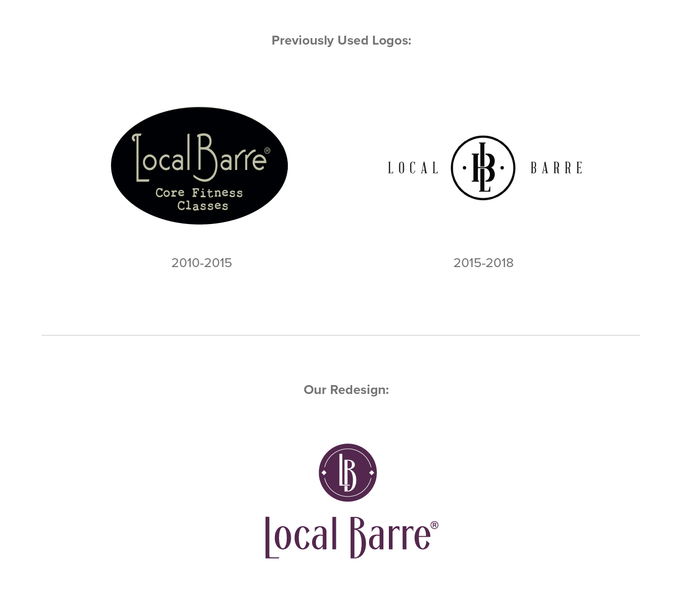
Remain true to the art deco vibes they has established in their original branding when they opened 9 years ago, while giving the logo a modern touch that would feel more at home in today’s LES. The tall & thin font style is true of the art deco era and mirrors the long and lean appearance clients seek in a barre class. The icon is simple, with minimalist touches that give it special character. The color palate is emulating the LES bar scene, but with a touch of sophistication. The red color brings in the sultry archetype the women who attend class should feel empowered to be.


