Perpetual Movement Logo Design & Branding
Brief:
Create the logo design and branding for an established Crossfit Gym in Tempe, AZ seeking to rebrand as they moved locations and changed names. For the owners, the name “Perpetual Movement” represents the idea that we are all bodies in perpetual motion moving towards personal improvement, knowing that perfection is impossible, but believing that fitness is a lifelong pursuit. The goal was to communicate that the brand is friendly & welcoming but still professional; modern and forward-thinking but with deep roots; and a place to work extremely hard but still have fun doing it.
Concept:
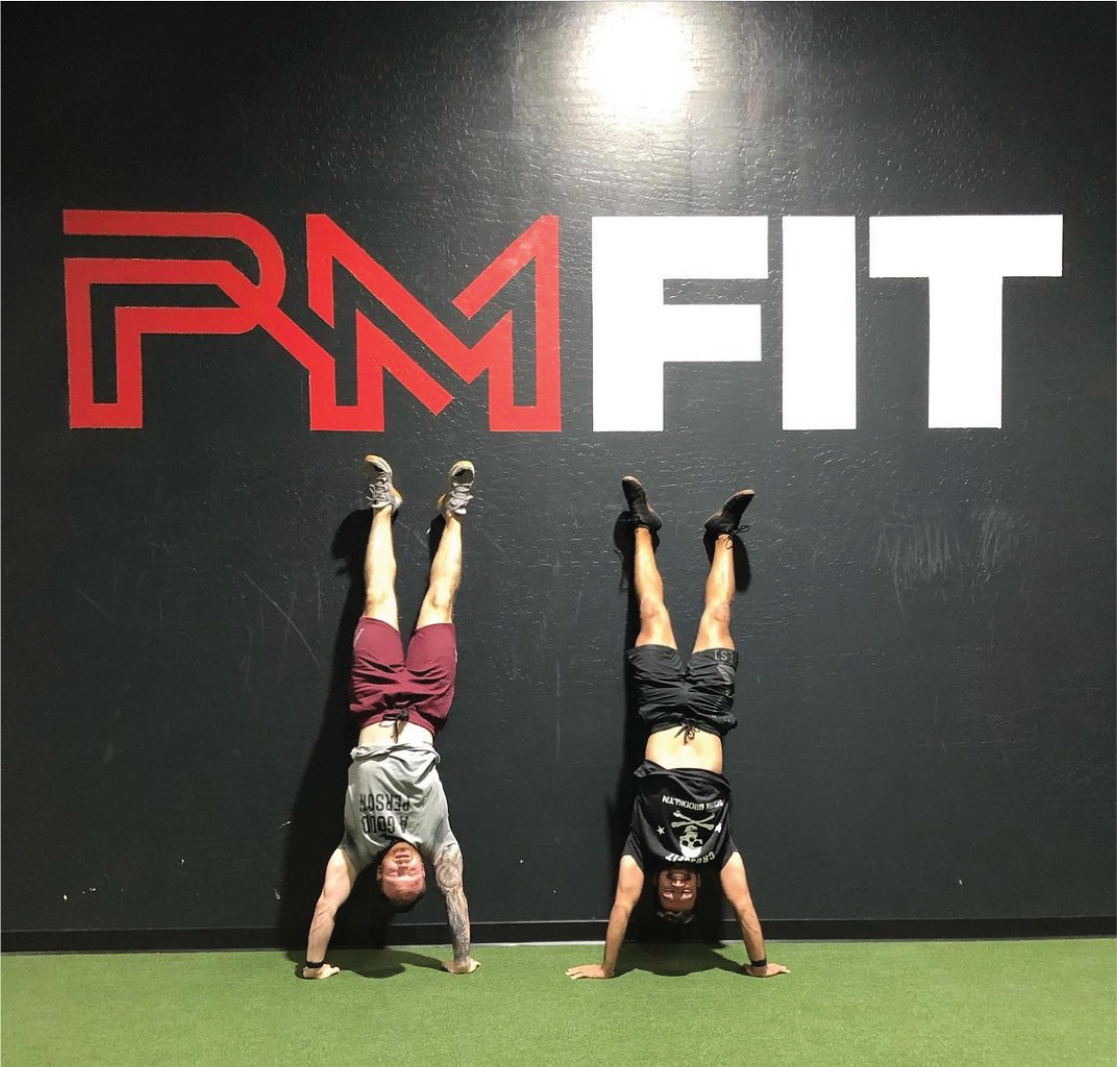
The final logo is made up of interconnected letterforms that speak to the perpetual nature of the lifelong journey members will embark on. The dynamic nature of the lines imply motion, and the fact that they are strong and bold gives it a toughness that appeals to the CrossFit audience. It is modern and cutting edge, which is important considering the high price point of memberships. It has a level of engagement and storytelling without being complicated and cluttered. It's clean and eyecatching but still communicates the brand values. Because the name of the company is very lengthy, the owners knew they would regularly go by “PM Fit” instead of the full name. With this in mind, we designed the logo to function as a system where they could use the full logo, abbreviated version, or simple icon to equal effect depending on the use case.


